
What UX Features Do Users Expect From Apps in 2026?
Explore the emerging UX features transforming mobile and web applications, helping businesses create faster, smarter, and more engaging digital experiences.
The Floor: What Users Now Expect as Standard
Users in India expect apps to load fast on 4G. The 3-second threshold that applied to websites a decade ago now applies to app screens. Above 3 seconds: measurable drop-off. Above 5 seconds: the user is already doing something else.This is not purely an engineering problem. Design decisions affect load time: image weight, animation triggering, the number of API calls needed to render the first meaningful screen. A design system built with performance awareness ships lighter.
Table of Content


The Floor: What Users Now Expect as Standard
Users in India expect apps to load fast on 4G. The 3-second threshold that applied to websites a decade ago now applies to app screens. Above 3 seconds: measurable drop-off. Above 5 seconds: the user is already doing something else.This is not purely an engineering problem. Design decisions affect load time: image weight, animation triggering, the number of API calls needed to render the first meaningful screen. A design system built with performance awareness ships lighter.
Clear, recoverable error states
Error messages are the most underdesigned screen in most apps. The standard failure looks like this: a generic "something went wrong" message with a dismiss button and no path forward.Users expect to know what specifically went wrong, in plain language rather than an error code. They expect to know what they can do about it. And they expect that their previous input was not lost.Payment errors, form validation failures, failed uploads: these are high-stress moments. The quality of the error state determines whether the user tries again or abandons.
Biometric authentication where data is sensitive
Password re-entry for banking, investment, or health apps is now a friction point significant enough to affect retention. If your app handles sensitive data and you're not offering Face ID or fingerprint as the default authentication path, you're creating unnecessary dropout at a moment of high intent.This is a baseline expectation for fintech. It's becoming a baseline expectation for healthcare, productivity, and any app with a persistent state users return to regularly.
Consistent tap targets at minimum 44 by 44 pixels
Small tap targets are one of the most common and most frustrating UX failures in mobile products. The 44px minimum from Apple's own guidelines is widely cited and widely ignored.Users don't complain about this. They mis-tap, get frustrated, and associate the feeling of frustration with your product. In usability testing, this is one of the first things we see: users tapping the wrong element repeatedly without understanding why.
Accessible contrast ratios
WCAG AA contrast ratios (4.5:1 for normal text) are no longer a nice-to-have for accessibility. They're a baseline readability expectation. With the prevalence of dark mode, high ambient light environments, and older users in your cohort, insufficient contrast is a functional failure.
The Ceiling: What Users Notice and Talk About
Rather than describing good abstractly, here's what strong UI/UX design output actually produces.
These are the qualities that aren't expected but create strong positive impressions. They drive word of mouth, App Store reviews, and the "this app just feels right" effect that founders talk about without being able to name what's producing it.
Continuity, the app knows where you were
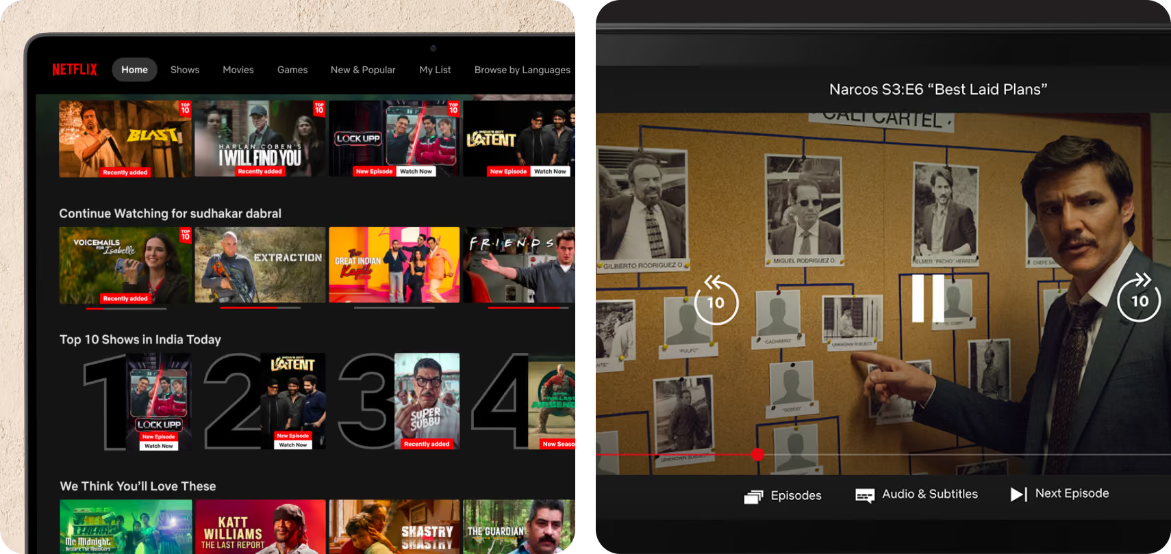
When you return to Netflix, it shows you what you were watching. When you return to Figma, it opens the last file. This expectation, that apps remember and continue rather than resetting, is now present for most types of products.
For task-based apps, a productivity tool, or a reading app, this is relatively easy to implement. For more complex products, it requires intentional state management. But the payoff is real: users who experience good continuity are measurably more likely to build regular usage habits. Check in your own product: if a user opens your app, navigates to a specific state, closes it, and reopens 24 hours later, where do they land? Does it feel like a continuation or a reset?
For task-based apps, a productivity tool, or a reading app, this is relatively easy to implement. For more complex products, it requires intentional state management. But the payoff is real: users who experience good continuity are measurably more likely to build regular usage habits. Check in your own product: if a user opens your app, navigates to a specific state, closes it, and reopens 24 hours later, where do they land? Does it feel like a continuation or a reset?
Instant feedback on every interaction
There's a specific quality that distinguishes apps that feel fast from apps that are fast. It's not about actual performance. It's about immediate visual or haptic acknowledgment of every interaction.When you tap a button, something should change in under 100 milliseconds, even if the underlying action takes 2 seconds.
A subtle scale animation, a colour change, a haptic pulse. This feedback closes the loop between intent and confirmation.Apps that don't do this feel sluggish even on fast hardware. Apps that do this feel responsive even when they're not. This is often a design system problem, not a performance problem, which means it's fixable without an engineering sprint.
Smarter on repeat use
The best apps get easier the more you use them. Recently used actions surface more prominently. Suggested inputs remember patterns. Power users find shortcuts appearing as they develop habits.This is not the same as algorithmic personalisation, which often means recommendations.
This is behavioural adaptation: the app learning your specific patterns and reducing friction for you specifically.Simple implementation that any team can do now: recently used items at the top of dropdowns, saved payment methods surfaced first, last-selected filter preserved when you return to a view.
Proactive error prevention over reactive error handling
The gold standard in form design is an experience that makes it nearly impossible to submit incorrect input. Real-time validation, format masking for phone numbers and dates, clear input labels that prevent misunderstanding: these reduce errors before they happen.
This matters especially in fintech, where users entering financial information have high anxiety and low tolerance for ambiguity. Moving from post-submission validation to real-time inline validation consistently reduces form abandonment in the products we've worked on.
Notifications that earn their place
Notification fatigue is real. The apps users trust are the ones that have earned the right to send notifications by making every notification worth opening.At minimum, users expect to be able to turn off notification categories independently, not just globally. At the ceiling level, notifications are contextually relevant: they arrive when the information is actionable, not just when the app wants engagement. "Your SIP is due tomorrow" is useful. "Check out what's new in the app" is not.
Apps that use notifications well report significantly better 30-day retention. Apps that overuse them see permission revocation rates above 40%.
The B2B App Context: Slightly Different Rules
Everything above applies to consumer apps. B2B apps, including SaaS dashboards, enterprise tools, and internal products, have a different set of expectations.B2B users expect keyboard navigation, since they're on desktop and are power users.
They want dense information without clutter: data visible by default, not progressive-disclosed. They need bulk actions for repetitive tasks, reliable export functions in CSV or PDF, and contextual help that doesn't interrupt the flow through tooltips rather than modals.The biggest UX failure in B2B products is designing them like consumer apps: progressive disclosure, minimal interface, one-thing-per-screen. Enterprise users want efficiency. Fewer clicks for power users, not fewer options.
How Expectations Differ by User Demographic
It is worth being specific about how user expectations vary by the audience your product serves, because designing to a single expectation set leads to friction for users outside that group.Younger users between 18 and 30 have the highest performance expectations and the lowest tolerance for unclear design patterns. They have used hundreds of apps and they pattern-match immediately. If your navigation doesn't follow expected conventions, they don't explore to find what's different.
They leave. For this group, convention is not a limitation. It is a trust signal.Working professionals between 30 and 45, particularly those in financial services, healthcare, and enterprise roles, place the highest weight on reliability and information density. They are time-poor and task-focused. They want to get in, do the thing, and get out.Onboarding flows that delay the core action, even well-designed ones, are experienced as friction rather than guidance. For this group, speed to value is the defining UX expectation.Older users above 50, a segment that is growing rapidly in India across fintech, health, and government services, have different expectations around legibility and error recovery. Text size, contrast, and the clarity of confirmations are not accessibility add-ons for this group.
They are the product. Designs that rely on icon-only navigation, low-contrast colour palettes, or small tap targets will see disproportionate abandonment from this cohort regardless of how polished everything else is.Understanding which demographic dominates your user base, and designing explicitly for their expectation set rather than an averaged middle, is one of the highest-leverage UX decisions a product team can make.
Why Most Apps Fail at the Moment That Matters Most
Most apps lose users not in the first session but in the moments between sessions. The return visit is where retention is decided, and most apps are not designed for it.The pattern goes like this: a user downloads an app, completes onboarding, takes one core action, and closes the app.
When they return 48 hours later, the app opens to a home screen that shows no memory of what they did before. There is no prompt to continue, no contextual starting point, no sign that the app knows who this person is or what they were working on. So the user has to re-orient, re-find their context, and re-commit to the task.Some do. Many don't.This is a state management problem that manifests as a retention problem.
The fix is not always technically complex. Storing the last screen visited, resuming a partially completed form, surfacing the most recent action on the home screen: these are relatively lightweight engineering tasks that have outsized effects on 7-day and 30-day retention.The apps that win on retention are the ones that make returning feel easier than starting fresh. Every feature you ship should be evaluated against this question: does this make it easier to come back?
A Five-Question Self-Audit You Can Run Today
These five questions surface more real UX problems than most agency audits charge ₹5 lakhs to produce.
- Tap the primary action in your app 20 times, quickly. Does it feel responsive every time? Do you get feedback in under 100ms each time?
- Put your app through a network throttle set to 3G. What's the first meaningful content a user sees, and how long does it take?
- Trigger your most common error state intentionally. Is the message clear? Does the user know what to do next?
- Open your app after 48 hours away. Where does it take you? Does it feel like continuation or a reset?
- Look at your last push notification. Would you open it if you didn't work at this company?
If Your App Isn't Meeting These Expectations
Two paths forward.Audit first. We run UX audits that map your current experience against user expectations specific to your category. It's a fixed-scope engagement that produces a prioritised fix list, not a lengthy report but a ranked set of changes with expected impact.Revamp second.
If the audit reveals systemic issues rather than tactical fixes, a structured revamp addresses the root causes rather than patching symptoms.
Latest Articles
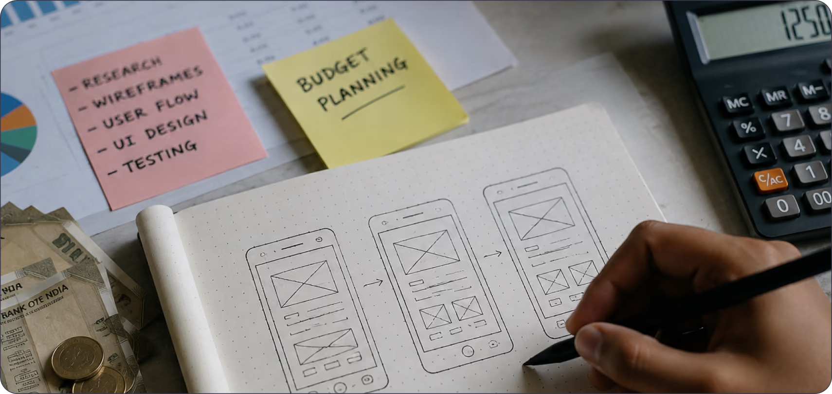
How Much Does UI/UX Design Cost in India?
Understand the key factors that influence UI/UX design pricing in India, from project scope and complexity to designer expertise and business requirements.
Latest Articles
What Does "Funded Startup" Mean When You Pick a Design Agency in India?
"Funded startup" means two different things in India right now, and most agency content mixes them up. One meaning comes from the government. The other comes from VCs and marketing copy.
Latest Articles
What Should Fintech Founders Look For in a UI/UX Design Agency in 2026?
Two terms cause most of the confusion when fintech founders search for design help this year. "Dark pattern" has two separate legal definitions active in India right now, and "UX agency" covers three completely different service models under one label.
Latest Articles
Mobile UX Trends in 2026: What's Actually Changing and What's Just Noise
Every year, the same list circulates: dark mode, gestures, micro-animations, personalisation. Most of it is either already standard or too surface-level to act on.
Latest Articles
How Can Startups Optimise Their UX Strategy
Dive into the world of UX Strategy tailored for startups in Bangalore. Find out how great UX impacts brands and drives growth in Startup India and USA.
Latest Articles
How to Choose a UI/UX Design Agency in India
If you're searching for a UI/UX design agency in India, you're probably already comparing portfolios, reading case studies, and trying to figure out whether the quality you're seeing is repeatable or was a one-off effort for a big client.
Latest Articles
Design Systems 101: Building UI That Truly Scales
Discover how to create effective design systems for Figma. Enhance your UX with reusable components and streamline your workflow using Figma components.
Latest Articles
How to Design for AI - 101: Essential Tips and Tricks
Discover essential tips in our guide on How to Design for AI - 101. Learn the fundamentals and best practices for creating effective AI-driven designs.
Latest Articles
Design Trends 2026 Modern Ideas for Brands
Explore design trends 2026 shaping modern brands. Learn about AI, minimal design, bold typography, motion design, and sustainable strategies.
Latest ArticlesAbout Author:


Why choose Pen on Paper for future-ready design?


Got a question?
Get your answer

Ready to build AI-powered digital experiences?
Lorem ipsum dolor sit amet, consectetur adipiscing elit. Nunc vulputate libero et velit interdum.