
Design Systems 101: Building UI That Truly Scales
Discover how to create effective design systems for Figma. Enhance your UX with reusable components and streamline your workflow using Figma components.
Creating Scalable UI with Design Systems
Creating scalable products is no longer just about great design, it's about creating systems that support growth. Design systems bring together reusable components, clear guidelines, and shared standards, enabling teams to work faster while delivering consistent experiences at every touchpoint.
Table of Content

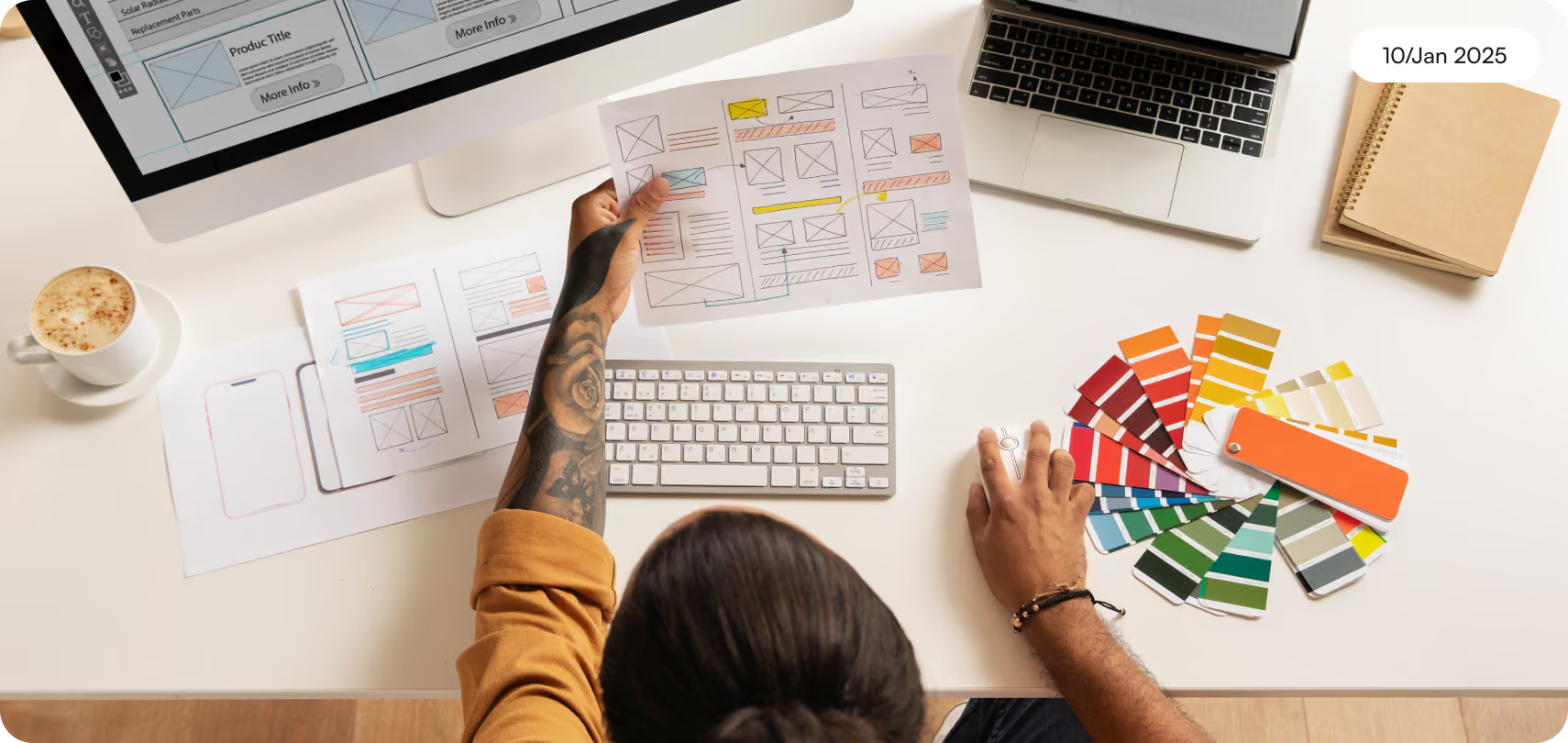
What is a Design System in today’s product world?
It combines:
- Use design elements and UI elements again and again.
- Keep the visual language the same.
- Follow rules for responsive design on various screen sizes.
- Bring in patterns that grow for web design and mobile apps.
But more importantly, it helps to make sure design decisions are made in the same way each time.
Teams use a system that helps keep layouts and design the same across all web browser types, devices, and touch points. They do not have to start from zero every time, so the look stays consistent for everyone.
Why growing products break without design systems
As startups grow, the design work starts to become more tricky. More team members join in to workon different features. If there is not a system in place, problems with how things look and feel show up fast.
You’ll often see:
- The buttons do not look the same on every screen.
- The spacing and layouts are not the same everywhere.
- The screens do not work well with all screen sizes.
- There are some parts that show up more than once in different flows.
- The development process is slow
This makes things hard not only for users, but also for the people who work inside the team.
Without a design system:
- UX designers often redo old work instead of coming up with something new.
- Developers have a hard time keeping parts the same in CSS and other things.
- Stakeholders feel less sure about how good the product is.
- The workflow breaks up and does not feel smooth.
A design system sets up a clear plan that helps the entire team work better together. It lets everyone move faster and feel sure about what they should do. A design system makes things easier for all in the group.
The building blocks of a scalable design system
A strong design system for figma is more than just a group of pieces. It is a way to think about design.
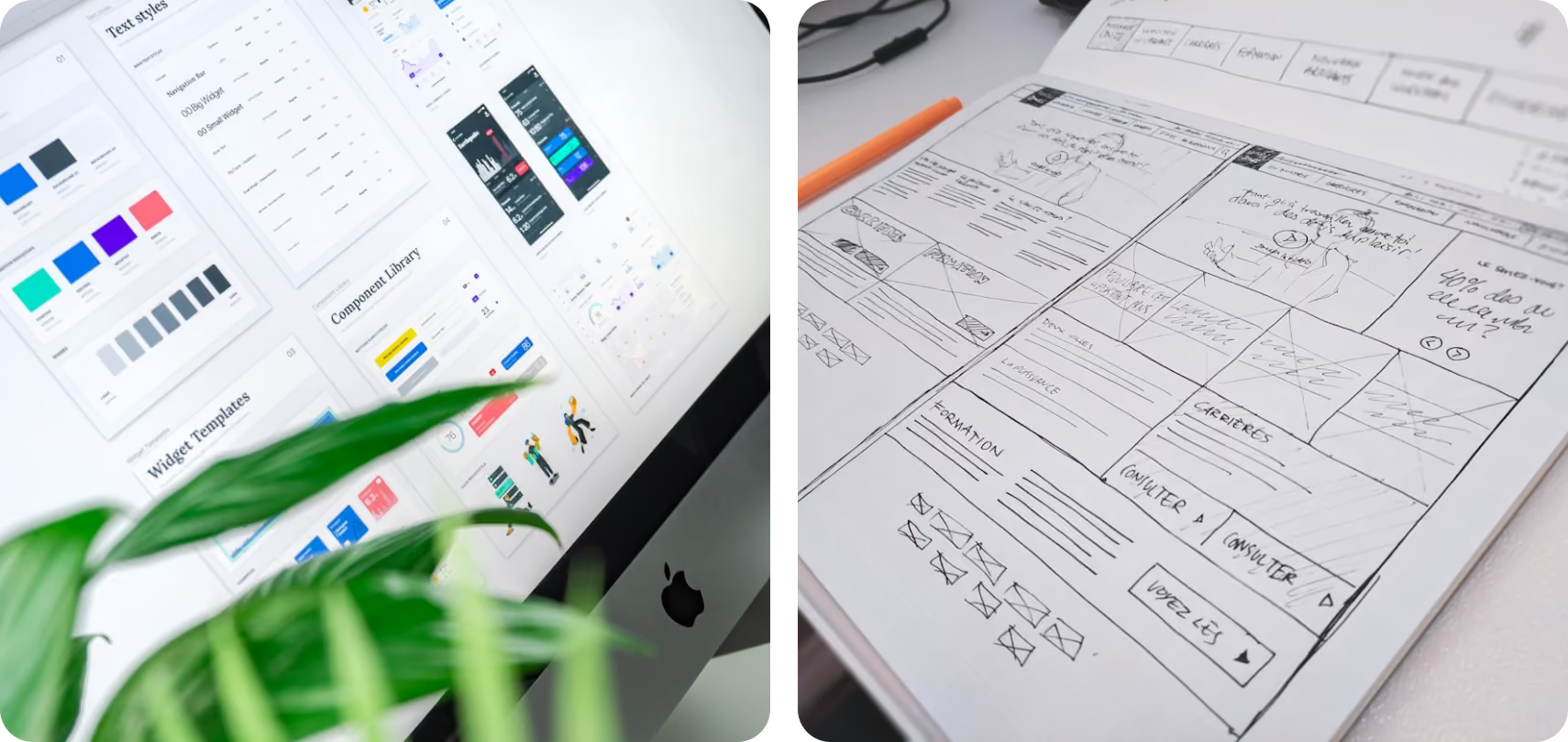
1. Design Tokens
These set your main styles. They include colors, typography, spacing, and shadows. Tokens help keep things the same in all your apps. It does not matter if people see them on different devices or on various screen sizes. This gives your apps consistency.
2. UI Components
Reusable parts like buttons, cards, and forms help make sure that your user interface looks the same everywhere in the product.
Well-structured components also support:
- Variants help give you more flexibility.
- You can make a prototype faster.
- Customization is easier.
3. Patterns & Layouts
Patterns show the way pieces work with each other—for example, in onboarding flows, dashboards, or checkout pages. This is where auto layout in tools is a powerful tool. It helps teams make flexible designs. These designs can easily fit different screen sizes and devices.
4. Documentation
Documentation makes it easy for everyone to use your system. This helps beginner designers and also works well for large design teams.
It answers:
- When should you use what
- How the components act
- The best practices to keep things the same
5. Governance
Without governance, design systems for Figma fail.
Clear ownership ensures:
- Updates are looked after.
- New parts match the standards.
- The system changes as the product gets better.

Tools that power modern design systems
Today, it is much easier to build design systems for figma because of the way things work now. The tools and resources you can use help make this job faster and better. Tools like Figma play a big role in figma design. It helps the entire team work together by sharing libraries and giving real-time updates. The figma community is also a great spot where you can find templates, plugins, and ideas to help you move faster.
Other tools support different parts of the system:
- Use tokens management tools for design tokens.
- Use Storybook to show details about each part.
- GitHub helps with version control in the development process.
- Project tools like Jira help line up design and project management.
Tools like FIGMA are a great choice.
What is the Figma Design System & component Library?
The Figma Design System gives you a full set of ready-to-use parts, styles, and rules for your work. It makes ui design faster and helps keep things clear and even, so every project looks the same. A team can use this design system to save time and make the work good for everyone. When you use this Figma design system, you can build flexible and clean user screens. It works well with all types of apps and platforms. You get consistency in every design you make with figma.
The Figma Design System is like a main place where design work can feel creative but also have order. It helps people who use Figma components to build with consistency, but still leave room for new ideas. In this system, you will get a design system that has a library with parts you can use again and again. You will find buttons, icons, and also text styles, like different typography. This makes it easy for teams to find what they need for their Figma design work. It helps make sure every part fits the rules the team wants to use, so everything looks good together.
When you start a design project, the system works like a steady guide. It helps designers know when to use different parts. It also shows how these parts work together with others in bigger user screens. The system talks about best practices. This helps keep everything looking good and working well for people using it.

Designing for scale: responsiveness and adaptability
One big advantage of having a design system is that it helps make real responsive design possible. A design system lets you build things that work well on many screen sizes. This means your site or app will look good on phones, tablets, and computers. A design system lets you do thisfast and in a good way. With a design system, it is easier to get good responsive results every time.
A good design system in Figma helps teams make interfaces that work well on different devices and screen sizes. When you use responsive design, you make sure each part of the design looks nice and also works well on any device. Figma design lets people follow these design principles so that things stay easy to use and look good, no matter which screen or platform you are on. This makes your design feel smooth and responsive everywhere.
With flexible grid systems and fluid layouts, the Figma Design System helps people build UIs that can change as users interact with them. This makes it easy for teams to grow their web or mobile projects without doing everything from scratch every time. The design system keeps things working well and looking good no matter how big the project gets. Figma design and layouts work together to make this possible.
Teams do not just design still screens now. They make systems that can change and fit in different ways.
- Tablet
- Desktop
- Different web browser places
This is where:
- Auto layout
- Fluid grids
- Flexible components
Get critical about how you work. When you make a design system in Figma, it helps keep things look the same everywhere. This can make the whole team work better together, from designers to developers. By using features like auto layout, your team can build screens that change size to fit any device. This way, the user experience stays smooth and looks good on all screen sizes. A design system in Figma makes it simple to have this kind of consistency.
The goal is not just to be quick to answer, but also to be steady every time someone talks to you.
How to start building a design system (the right way)
The best part is that you do not have to do everything right now. You can start small and add more later.
Start with a UI check for your product. Look for any differences in the design elements, layouts, and pieces that you use.
When you know what your design landscape looks like now, you need to pick the main parts that are most important for your design system. Put your attention on the things people use most, like buttons, navigation bars, input fields, and typography. Making these basic things the same in allparts of your work will help build a strong base for your design system.
Next, choose the colors you want to use for your brand. Pick both main and extra colors. Make sure these colors match your brand feel and follow accessibility rules. After that, set clear rules for typography. A good text style guide will help people read well on all devices.
After, make sure you write down everything in one place in Figma. This is your main library.
Then:
- Set your design principles.
- Make basic tokens for things like colors and typography.
- Build parts you can use again.
- Try your ideas in real life with user testing.
- Put together a working prototype
As your product grows, your system grows with it.
Creating Effective Design Systems in Figma
When teams start using a design system in Figma, they build a strong base for their work. This base helps to make ui design faster and easier. A design system also makes it simple for people from different groups to work together. The main goal of a design system is to keep things the same in the ui while still letting it change and grow with the product. A design system brings both consistency and room to improve as time goes on.
Key Elements of Your Design System
- Design Principles: Start by saying what kind of design principles are important to you. These should show your brand’s vision. They should also focus on what users need. Use these rules to guide you in every step of the design process.
- Component Library: Create a full library of components you can use again and again. Make sure every component follows your design principles. This library is the backbone of your design system. It gives your team the building blocks they need to make user interfaces quickly and well.
- Style Guide: Make a clear style guide for your design system. Include things like colors, typography, and spacing. Use this guide as your go-to for keeping the look feel the same on all platforms and devices.
- Documentation: Write down every part of your design system with care.
Content Strategy for Design Systems
1. User-Centered Content: Start by understanding your users’ needs, preferences, and behaviors. Create content that resonates with them by using language and tone appropriate for your audience. This approach not only improves usability but also strengthens the connection between users and your brand.
2. Consistent Language: Establish a glossary of terms used within the design system.
The best part: design systems unlock real creativity
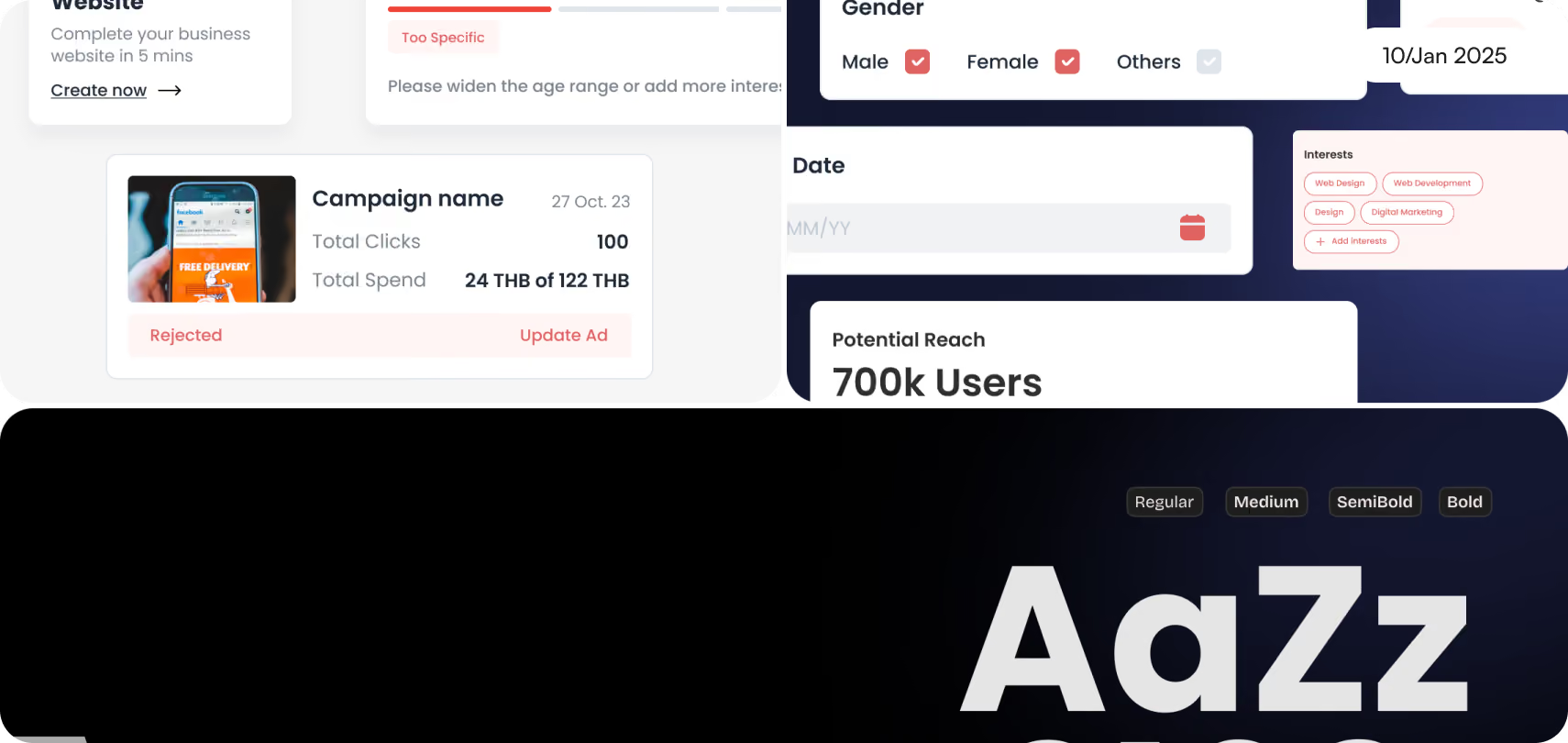
People often say that design systems limit creativity. But this is not true. A design system can help you be more creative. It gives you a set of tools, so you do not have to start from nothing every time. This can help you get new ideas faster and make your work better.
They take away the need to make the same choices again and again.
Instead of debating:
- Button styles
- Typography
- Spacing
Teams can focus on:
- The UX will be better.
- New things will happen quicker.
- The product will get updates that matter.
- This is what helps turn good UX design into great experiences with a product.
Implementation Strategies
- Collaboration Tools: Use Figma’s tools that help the team work together. You can get real- time feedback and make quick changes. Bring in team members like designers, developers, and product managers to join and see the design system right in Figma. This helps everyone feel included and makes everyone understand what is going on. When people can join in, share ideas, and see updates, the design gets better and is more focused on the user.
- Version Control: Set up a clear version control system inside your Figma files. This helps the team keep track of every change made to the design system and its parts. With this, all your team members, like product managers, developers, or designers, will have the most recent updates. If something goes wrong, it is simple to go back to the last good version.
The real impact: speed, scale, and trust
When you put a design system in place the right way, it can make a big difference. A design system helps the work get done faster and better. This is because everyone has the same tools and ideas to use for their jobs. So, when a design system is used well, it really helps the whole team do more than before.
- Shipping across apps is now faster.
- The user interface looks the same in all products.
- There is better alignment between design teams and developers.
- Collaboration with stakeholders is now stronger.
And most importantly, people feel the product is good, easy to use, and you can tell it was made with care.
Making sure things look the same on all platforms and devices is very important in design today. To do this, you need to write down every part of your design system in detail. When everything is clear, team members can always find what they need. This makes the design process better andhelps everyone work faster.
Many people think that design systems stop creativity. But this is not true. Design systems actually help get rid of doing the same tasks over and over again.
Latest Articles
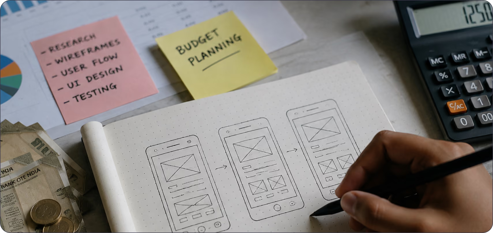
How Much Does UI/UX Design Cost in India?
Understand the key factors that influence UI/UX design pricing in India, from project scope and complexity to designer expertise and business requirements.
Latest Articles
What Does "Funded Startup" Mean When You Pick a Design Agency in India?
"Funded startup" means two different things in India right now, and most agency content mixes them up. One meaning comes from the government. The other comes from VCs and marketing copy.
Latest Articles
What Should Fintech Founders Look For in a UI/UX Design Agency in 2026?
Two terms cause most of the confusion when fintech founders search for design help this year. "Dark pattern" has two separate legal definitions active in India right now, and "UX agency" covers three completely different service models under one label.
Latest Articles
Mobile UX Trends in 2026: What's Actually Changing and What's Just Noise
Every year, the same list circulates: dark mode, gestures, micro-animations, personalisation. Most of it is either already standard or too surface-level to act on.
Latest Articles
What UX Features Do Users Expect From Apps in 2026?
Explore the emerging UX features transforming mobile and web applications, helping businesses create faster, smarter, and more engaging digital experiences.
Latest Articles
How Can Startups Optimise Their UX Strategy
Dive into the world of UX Strategy tailored for startups in Bangalore. Find out how great UX impacts brands and drives growth in Startup India and USA.
Latest Articles
How to Choose a UI/UX Design Agency in India
If you're searching for a UI/UX design agency in India, you're probably already comparing portfolios, reading case studies, and trying to figure out whether the quality you're seeing is repeatable or was a one-off effort for a big client.
Latest Articles
How to Design for AI - 101: Essential Tips and Tricks
Discover essential tips in our guide on How to Design for AI - 101. Learn the fundamentals and best practices for creating effective AI-driven designs.
Latest Articles
Design Trends 2026 Modern Ideas for Brands
Explore design trends 2026 shaping modern brands. Learn about AI, minimal design, bold typography, motion design, and sustainable strategies.
Latest ArticlesAbout Author:


Why choose Pen on Paper for future-ready design?

Got a question?
Get your answer

Ready to build AI-powered digital experiences?
Lorem ipsum dolor sit amet, consectetur adipiscing elit. Nunc vulputate libero et velit interdum.