
Mobile UX Trends in 2026: What's Actually Changing and What's Just Noise
Every year, the same list circulates: dark mode, gestures, micro-animations, personalisation. Most of it is either already standard or too surface-level to act on.
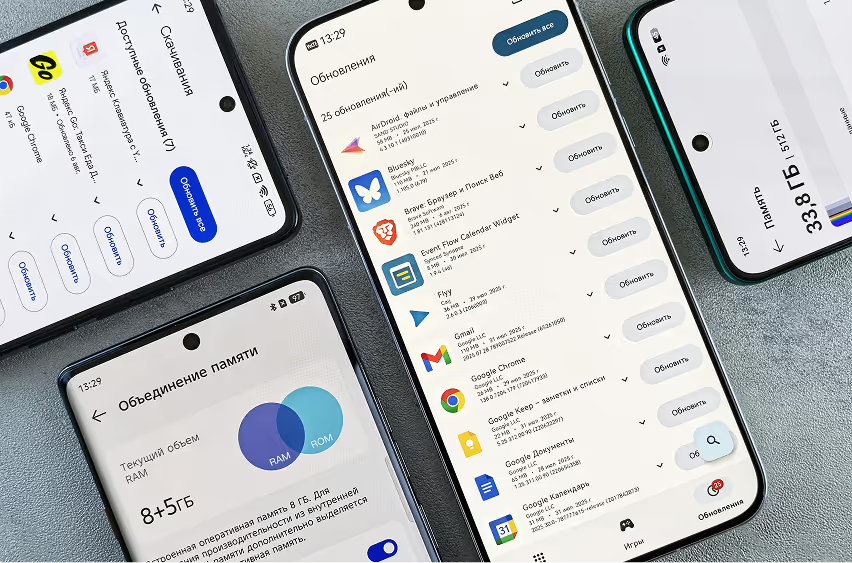
Trends that users expect from Apps.
This is a different kind of list. These are the mobile UX shifts we're seeing in actual products right now, in user research, usability testing, and the products we're designing and revamping for funded startups. If you're building or revamping a mobile product in 2026, these are the ones worth your attention.
Table of Content

1. Thumb-Zone Design Is Being Taken Seriously Again
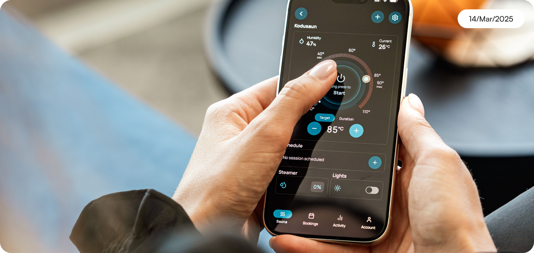
For a decade, thumb-zone design was in every UX textbook and ignored in almost every shipped product. In 2026, it's finally becoming a real constraint, because screens are bigger, app complexity is higher, and users are increasingly one-handed.The problem: most apps still put critical actions in the top third of the screen. Back buttons, navigation tabs, confirmation buttons, designed for the visual hierarchy of a 6-inch screen but unreachable by a thumb holding the phone.
What's changing: product teams are auditing their tap targets for one-handed use as a standard step in usability testing. We're seeing this show up as a specific brief requirement from startups that have done retention analysis and found correlation between bottom-screen action completion and session length.What to do: map your critical path interactions against the thumb-comfort zone for your target device. If your primary CTA sits in the top 40% of the screen, it belongs lower.
2. Friction Removal in Onboarding Has Reached Its Limits
For three years, the playbook was: remove every step from onboarding. Fewer fields. Defer registration. Let users in without creating an account.The data is catching up with this assumption. Products that removed too much friction from onboarding are discovering that users who don't commit early don't commit later either.
Activation rates are fine. 30-day retention is broken.The shift is toward intentional friction. The best mobile products in 2026 are adding back a single commitment step early in onboarding, not to create a barrier, but to create a psychological anchor. "Tell us what you want to achieve" at step two isn't a form field.
It's personalisation that makes the rest of the product feel made for you.What this means for your product: audit your onboarding not just for drop-off rate but for the quality of users who complete it. If you're getting high activation but low 7-day retention, your onboarding may be letting in users who were never going to stay.
3. Skeleton Screens Are Table Stakes Now
Skeleton screens (grey placeholder shapes that approximate the layout while content loads) became the default loading pattern a few years ago. The research was clear: users perceive skeleton screens as faster than spinners even at identical load times.In 2026, skeleton screens are table stakes.
They're not a differentiator. The trend that is differentiating products is progressive loading with meaningful first content, ensuring the first piece of content that loads is the piece the user came for.For a social feed: the first post loads, not the header, not the nav, not an ad.
For a financial app: the account balance loads, not the transaction history, not the notification badge. For a news app: the headline loads, not the category filters.What to do: instrument your app to measure time-to-first-meaningful-content separately from overall page load. Optimise the former, not the latter.
4. Voice UI Is Moving Into B2B Mobile Products
Voice UI has been in consumer apps for a decade. In 2026, it's moving into B2B mobile products, particularly in logistics, field sales, and healthcare, where users physically can't interact with a screen.The UX challenge isn't voice recognition. It's error recovery.
When voice input fails, which it does, the fallback experience determines whether the user trusts the feature at all. Most voice implementations get the happy path right and the error state completely wrong.
Products building AI-assisted interfaces are starting to treat voice as a first-class input method alongside touch, rather than a bolt-on feature. If your mobile product serves users in contexts where hands are occupied such as delivery, warehouse, field service, or clinical settings, this is worth a prototyping sprint now.
5. Haptic Feedback Is Being Used to Communicate State, Not Just Acknowledge Input
Haptic feedback has been available for years. Most apps use it as decoration: a vibration on every button tap, regardless of whether the action matters.In 2026, the best mobile products are using haptics to communicate state, not just acknowledge interaction. A different haptic pattern for "action confirmed" versus "action failed" versus "something needs your attention" creates a communication layer that works without the user looking at the screen.
This is especially important in fitness, health, and payments. In the StanceBeam cricket coaching app, deliberate haptic cues tied to bat sensor data made feedback feel immediate and physical.
That sensory connection between data and sensation is part of why the product works.What to do: audit your haptic implementation. If you're using a single pattern for everything, you're leaving a communication channel unused.
6. Dark Mode Is a Trust Signal in Professional Categories
Dark mode adoption in apps that launched with it as a feature is now close to 50% of active sessions in categories like productivity, finance, and developer tools. For apps serving these categories, not offering dark mode in 2026 reads as outdated, similar to how a non-responsive website read in 2016.
Beyond battery life and readability, dark mode has become a trust and quality signal in professional contexts. Products targeting developers, power users, and finance professionals that don't offer it face an implicit credibility question.Implementation note: dark mode is not inverting colours. It's a separate visual system.
Shadows become glows. Elevation changes. Contrast hierarchies shift. Implementing dark mode properly requires a design system with semantic colour tokens, not a filter applied to your light-mode design.
7. Gesture Navigation Has Forced a Rethink of In-App Navigation
iOS and Android have both moved aggressively toward gesture-based system navigation. This has broken a significant number of apps whose own navigation gestures conflict with system gestures.The practical consequence: the "back" interaction is now ambiguous.
Is the user swiping to go back in the app, or swiping to exit the app? In apps with horizontal carousels, swipe-to-dismiss modals, and side drawers, gesture conflicts are now one of the most common usability issues we find in audits.
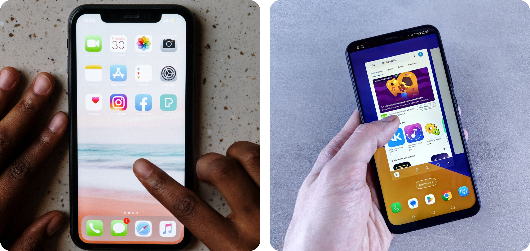
What to do: test your app on both iOS and Android with system gestures enabled. Map every swipe gesture in your product against the system gesture layer. Any conflict needs to be resolved, either by shifting your gesture, adding a visible alternative, or removing the conflicting interaction.
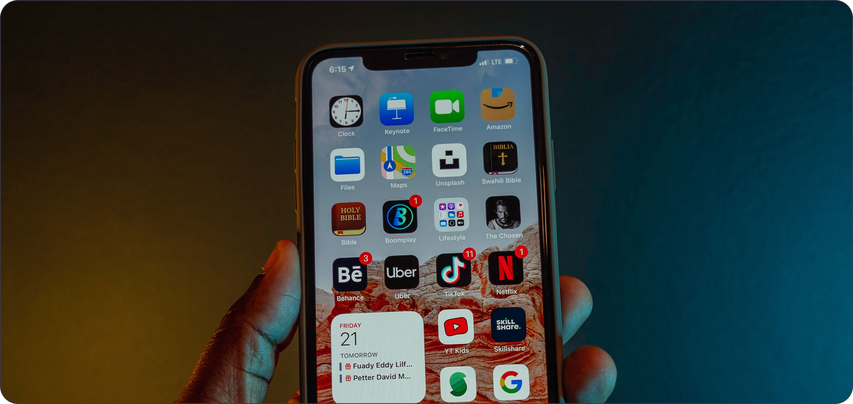
8. What Users Expect From Apps Now
One query showing up in our research: "what ux features do users expect from apps now?" The answer has bifurcated.
Baseline expectations that, if missing, are disqualifying: sub-3-second first load on mobile data, accessible tap targets at minimum 44x44px, clear error messages with a recovery path, biometric authentication where sensitive data is involved, and offline or cached state for core functionality.
Differentiating expectations that drive retention: the app knows what I was doing last time and continues from there, feedback is instant so I never wonder if my tap registered, the experience is faster on repeat use than on first use, and notifications are relevant and controllable.The gap between these two categories is where mobile UX strategy lives. Our UI/UX design process starts by mapping where your product sits relative to both.
How Mobile UX Priorities Differ by Category
The trends above apply broadly, but the order of priority shifts depending on what kind of product you're building.For fintech and payments apps, the single highest priority is trust signalling at critical moments. Users are handing over money or financial data. Every interaction at that moment, confirmation screens, error states, security indicators, needs to communicate reliability more than anything else. Speed matters. Clarity matters more.
Haptics, animations, and visual feedback all play a role in making a payment feel safe and confirmed.For entertainment and media apps like Hungama, the priority shifts to engagement continuity. The critical experience is not the first session but the second and third. Does the app remember what the user was watching? Does content discovery feel personalised or generic? Is the transition between pieces of content smooth enough that users don't drop out between sessions? The UX of "what happens after" is more important than the UX of"what happens first."For health and fitness apps like Squegg, the experience must survive physical context.Users are exercising, recovering, or tracking habits in environments where their attention is divided.
Screen readability in bright light, one-handed navigation, haptic feedback as the primary output channel, and sessions that can be paused and resumed without losing state: these are the design constraints that separate products that get used from products that get uninstalled after the first week.For B2B SaaS with a mobile component, the expectation is that the mobile app serves a specific use case rather than replicating the full desktop experience. The teams that get this right identify the 2 to 3 tasks a user would genuinely do on mobile, build those exceptionally well, and leave the rest to desktop. The teams that get it wrong try to compress the entire product into a phone screen and produce an experience that serves no context well.
The Audit You Should Run Before You Redesign Anything
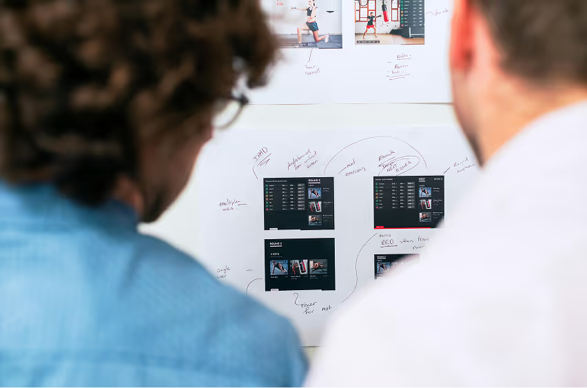
Before any revamp or redesign, run this audit on your existing product. It takes less than a day and will tell you where the actual problems are, rather than where you assume they are. Start with a session recording review. Watch 20 real user sessions without commentary.Note every moment a user hesitates, mis-taps, backtracks, or exits. You will see 3 to 5 consistent failure points. These are your actual UX problems, not the ones your team has been debating in Figma.
Next, run a tap-target audit on your five most-used screens. Check every interactive element against the 44px minimum. Check where the most-used actions sit relative to the thumb-comfort zone on a standard screen size.Then test the critical path cold, with someone who has never used the product. Give them one goal: do the thing the product is built to do. Time them. Count the steps. Note where they hesitate or ask questions.
If a new user cannot complete the core action without guidance, the critical path needs work before anything else.Finally, trigger every error state you can find. Screenshot each one. Read the message out loud. If you would not understand what to do next from that message alone, it needs to be rewritten. This audit is more useful than any trends list, including this one.
What This Means If You're Building or Revamping a Mobile Product
The trends above are not a checklist. They're signals about where user expectations are moving.If you're building a new mobile product, the question is: which of these signals is most relevant to your user's context and your product's core interaction?
That's the brief.If you're revamping an existing mobile product, the question is: which of these is a current source of friction in your product? That's the audit brief.We do both. See how we've approached mobile product design across fintech, sports, and entertainment.
Latest Articles
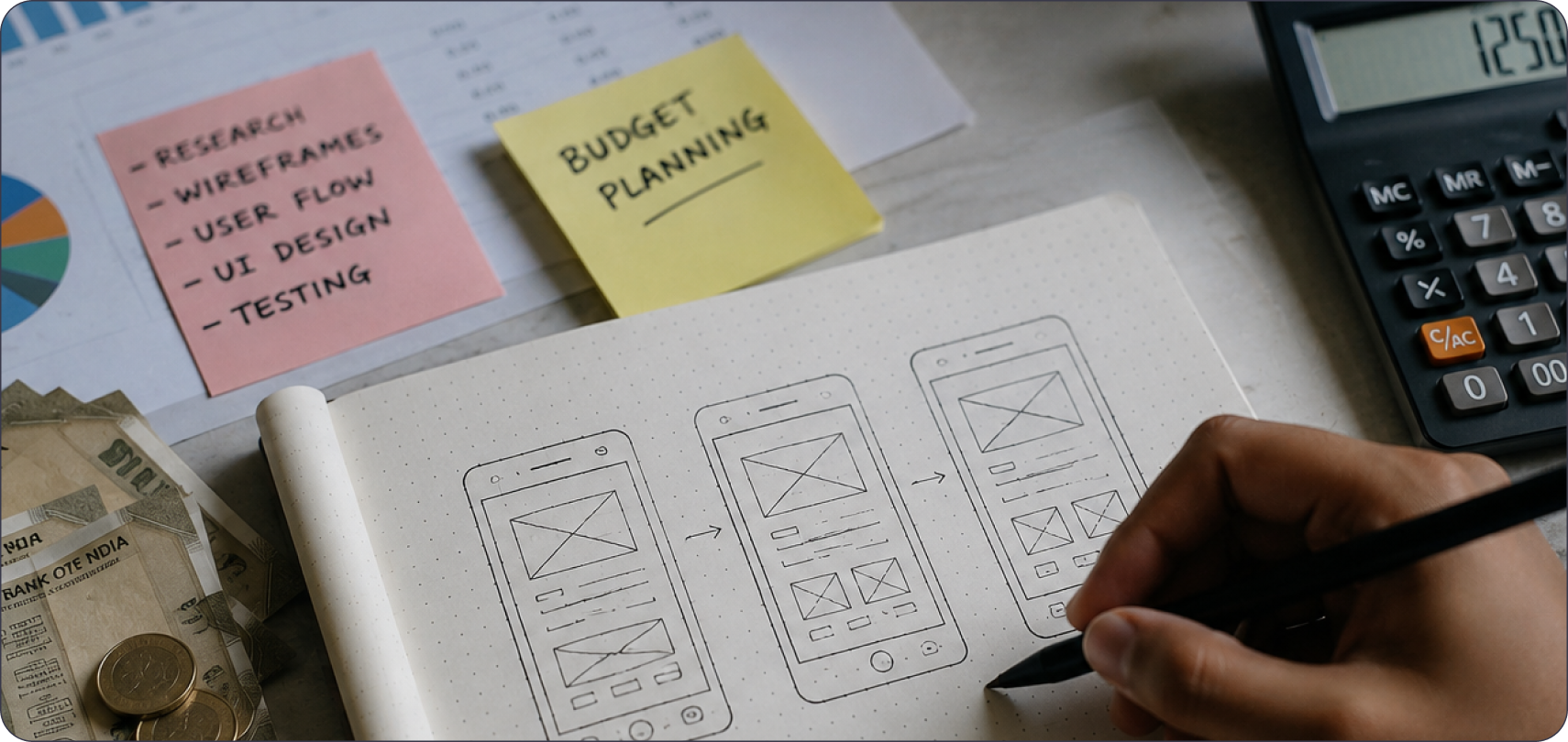
How Much Does UI/UX Design Cost in India?
Understand the key factors that influence UI/UX design pricing in India, from project scope and complexity to designer expertise and business requirements.
Latest Articles
What Does "Funded Startup" Mean When You Pick a Design Agency in India?
"Funded startup" means two different things in India right now, and most agency content mixes them up. One meaning comes from the government. The other comes from VCs and marketing copy.
Latest Articles
What Should Fintech Founders Look For in a UI/UX Design Agency in 2026?
Two terms cause most of the confusion when fintech founders search for design help this year. "Dark pattern" has two separate legal definitions active in India right now, and "UX agency" covers three completely different service models under one label.
Latest Articles
What UX Features Do Users Expect From Apps in 2026?
Explore the emerging UX features transforming mobile and web applications, helping businesses create faster, smarter, and more engaging digital experiences.
Latest Articles
How Can Startups Optimise Their UX Strategy
Dive into the world of UX Strategy tailored for startups in Bangalore. Find out how great UX impacts brands and drives growth in Startup India and USA.
Latest Articles
How to Choose a UI/UX Design Agency in India
If you're searching for a UI/UX design agency in India, you're probably already comparing portfolios, reading case studies, and trying to figure out whether the quality you're seeing is repeatable or was a one-off effort for a big client.
Latest Articles
Design Systems 101: Building UI That Truly Scales
Discover how to create effective design systems for Figma. Enhance your UX with reusable components and streamline your workflow using Figma components.
Latest Articles
How to Design for AI - 101: Essential Tips and Tricks
Discover essential tips in our guide on How to Design for AI - 101. Learn the fundamentals and best practices for creating effective AI-driven designs.
Latest Articles
Design Trends 2026 Modern Ideas for Brands
Explore design trends 2026 shaping modern brands. Learn about AI, minimal design, bold typography, motion design, and sustainable strategies.
Latest ArticlesAbout Author:


Why choose Pen on Paper for future-ready design?

Got a question?
Get your answer

Ready to build AI-powered digital experiences?
Lorem ipsum dolor sit amet, consectetur adipiscing elit. Nunc vulputate libero et velit interdum.