Jun 16, 2025
How Can Startups Optimize Their UX Strategy

In 1908, Gideons International decided they had found the perfect way to market their faith. They started distributing free Bibles to every hotel they could find. Over a century later, the hotel Bible is a cultural staple, featured in thousands of movies and TV series annually.
Startups also operate in the same disadvantage as Gideons, and they can improve their distribution by improving their UX.
User experience (UX) is how you create and captivate your audience. In our experience, every step and every animation changes how your apps are perceived. And perception is crucial to your growth strategy.
Ask Steve Jobs, and you can form a concrete understanding: “Some people think design means how it looks. But of course, if you dig deeper, it's really how it works. The design of the Mac wasn't what it looked like, although that was part of it. Primarily, it was how it worked. To design something really well, you have to get it.”
UX design is a strategic imperative, but it’s challenging to do on a startup budget. Thankfully, businesses and enterprises have spent years trying to solve this problem at scale. So, in this article, we’re going to take you through these strategies so that you can implement the top mobile UX trends into your app. We’re going to cover:
How to deal with resource constraints?
How to Maximize the ROI of UX?
How to Use Benchmarks to Build a UX Strategy?
How to Allocate Budget for UX?
90-Day UX Implementation Plan
Conclusion
How Can Startups Deal with Resource Constraints in UX?
Great UX doesn’t have to wait for a Series-C budget. Pick your prioritization order for design by following these principles:
Benchmark Against 2025 Retention Norms
Design feels less like guesswork when you know what “good” looks like. According to the latest UXCam benchmark study, average Day-30 retention sits around 11.3% for News, 3.6% for Lifestyle, and 2.1% for Education apps.
Action step: Calculate your Day-30 curve and stack it against the median. Anything ≥ 10% above the norm is a moat—double-down there. Anything ≥10% below jumps to the top of the roadmap.
Design levers to move retention
On-boarding reinforcement (progress bars, checklists)
Contextual nudges timed to abandonment moments
Lightweight win-back journeys (push + email) that route lapsed users to fresh value in ≤ 15 s
Apply the 80/20 Design Rule

Early-stage teams rarely have a shortage of ideas, only from the time and talent to ship them all. So, aim 80% of this quarter’s design hours at the 20% of flows that influence sign-ups, first transactions, and renewals.
How to spot the 20%: Run a quick funnel analysis (Amplitude, Mixpanel, PostHog). Whichever three screens precede your most significant drop-offs are your power pages. We did this analysis for Scalenut when we developed their mobile UX.
Why it works: IBM Design’s take on the 80/20 rule shows that concentrating effort on a handful of “moment-of-truth” screens consistently delivers outsized returns and keeps teams from polishing low-impact corners.
Guardrails: Freeze secondary flourishes—dark-mode tweaks, Easter eggs, micro-copy polish—until those core flows hit their KPI targets.
Build a Stage-Aligned UX Roadmap
Treat each funding milestone as a UX spike—a focused burst of discovery and design work that unlocks the next tranche of growth. The concept comes from agile practice, where a “UX spike” is a dedicated sprint for research and prototyping before development resumes.
Funding stage | UX-spike focus | Success signal |
Prototype / Angel | Click-through fake-door test | Problem-solution fit → ≥ 30% sign-up intent |
Seed | MVP hardening—error states, empty states, accessibility basics | ≤ 1% crash rate, ≥ 60 CSAT for first-time users |
Series A | Growth tuning—personalisation loops, A/B engine, referral hooks | +15% MoM activation |
Resource constraints force clarity. By funneling effort into pivotal flows and grounding every decision in live retention data, you can improve your UX. Using these budgetary boundaries, we can start talking about maximizing the ROI of UX. We will focus on some basic strategies that have worked for our clients.
How Can You Maximize the ROI of User Experience?
When you start building the UX for your app, the priority should be performance. Speed is still the core factor that influences the overall success of your mobile apps.
According to studies:
On average, 1 second of extra load time knocks 7% off (Invesp).
Google’s retail telemetry shows that the exact second can wipe out up to 20% of mobile check-outs.
At the 3-second mark, 53% of visitors abandon the session entirely—Prioritise CDNs, lazy-loading, and code-splitting before shipping new features.
When the tech is configured for better speed and performance, you can focus on improving the UX through the mobile app UX trends. Some trends that can work for technology companies are that we’ve mined from different analyses and our experience:
Minimalism - A 2024 MoldStud meta-review found that 62% of smartphone users actively prefer “straightforward” layouts with generous whitespace and few tappable elements, and conversion rates follow that preference.
Micro-interactions - Subtle haptics, progress pips, and emoji “likes” require little engineering yet measurably lift engagement and task-completion sentiment.
AI-driven personalisation - Deloitte’s Marketing Trends 2025 shows 75% of consumers are likelier to buy from brands that personalise content and journeys.
Privacy-first - Cisco’s 2025 benchmark reports 95% of customers walk away if they feel their data isn’t protected, and UXmatters notes 76% would stop buying after a single privacy mishap.
These statistics show how following these trends can help you get a competitive edge. Choose what you need when designing your UX, and focus on delivering your users the best, uncomplicated experience.
To decide which trends to use, you should focus on industry-wide benchmarks to formulate a strategy.
How Can You Use Benchmarks to Formulate a Strategy About UX?
You should track the following benchmarks to understand and modify the UX design for your mobile apps.
What to track | Why it matters | 2025 Benchmark | Action cue |
ROI of UX vs. CAC | Best-in-class product teams see every $1 spent on UX research/design come back as ~$100 in revenue. Tight product–market fit also fuels word-of-mouth, letting you dial down paid CAC. | $100+ revenue / $1 UX dollar | If your blended CAC is still rising, run a quick pre/post analysis on the last UX win (e.g., revamped onboarding) to prove or disprove the ROI story before the next board meeting. |
Day-30 retention by vertical | Boards now expect targets to be benchmark-anchored. UXCam’s 2025 table pegs Day-30 medians at 11.3 % (News), 3.6 % (Lifestyle), 2.1 % (Education). | ≥ median + 10 % = moat territory | Treat flows that already beat the median as “defend,” not “rebuild,” and funnel design hours toward the leaks two standard deviations below the norm. |
Time-to-Value (TTV) | The faster a new user experiences the “aha!,” the lower your churn risk. Userpilot’s 547-company benchmark shows top-quartile products (TTV ≤ 5 min of active use) post-churn rates roughly one-third lower than the slowest quartile. | ≤ 5 min from first launch to first meaningful success state | Map every first-run screen; if any click doesn’t move the user toward value, delete or defer it. |
Ratings & reviews leverage | A redesign that lifted Bytepad from 2.4⭐ → 4.4⭐ more than doubled WAUs. | Aim for 4.5⭐+ and a review volume that keeps the “Most recent” feed fresh | Automate in-app rating prompts after successful task completion; follow up on <4⭐ with an apology and a fix log. |
How to Use Benchmarks?

Pre-mortem your roadmap. Before green-lighting new features, ask, “Which benchmark gap does this close?”
Instrument first, design second. Without funnel and TTV tracking in place, you can’t prove progress.
Report in board-ready language. Benchmarks turn subjective design debates into objective “beat the median” conversations.
Anchor your following sprint goals to at least one of the rows above, and you’ll walk into investor updates with defensible, industry-contextual metrics instead of anecdotes.
Now that you can find directionality for your UX strategy, let’s talk about budget.
How do you budget for UX During Mobile App Development?
In our experience, most startups allocate their UX budget with this strategy.
Funding stage | Typical UX spend | Focus this quarter | Why that % works |
Pre-seed / Bootstrap | ≤ US $10 k(mostly tools + a contract audit) | Heuristic clean-ups | 44% of 2024 pre-seed rounds closed below $250k—so keeping design under ~4 % of the raise preserves runway. |
Seed | ≈ US $10 k – 50 k total(~US $10 k/mo lets you hire 1st product designer + run monthly Maze/Figma tests) | Feature-market fit tests On-boarding polish | Seed firms that invested ~ $10k monthly in growth/UX materially outperformed peers once they hit Series A. |
Series A + | 5 – 10 % of operating budget (in-house team + user-research kitty) | Design system & tokens | Fast-growing SaaS start-ups earmark 8-10% for brand & UX to defend differentiation at scale. |
Most Startups Invest in Boutique Agencies Instead of Hiring In-House
Pre-revenue, a full-time designer can stretch your budget. During this time, a specialised studio can plug the gap for a fraction of Silicon Valley salaries.
Why Work with Pen On Paper Instead of a Full-Time Designer?
Startup-size retainers: Monthly UX/UI pods start at ~$4.5k for 150 design hours, and the “Build-your-startup” sprint lands at $3k. This works without a lock-in and can be expanded to cover more issues.
Senior lead + dedicated designer: Get strategic oversight plus execution horsepower. This is useful when you’re still iterating on product-market fit.
Toolchain native: The team works in Framer, so your tech team can quickly pick up our cues.
Remote-first cadence: Daily syncs and fortnightly sprint demos slot neatly alongside a lean product team.
Tip: At ≤ $3–4.5k per month, a six-month POP retainer often costs less than one mid-level US hire (salary + taxes + benefits ≈ $9 k/mo) and keeps you flexible if priorities shift.
Getting the most from your allocation
Ring-fence “learning money.” Treat 15% of the UX line as non-negotiable spend on continuous research (sessions, Maze tests, analytics add-ons).
Bundle quick wins into retainer hours. Have the agency attack high-impact fixes first, before exploring new features.
Measure, celebrate, re-invest. Show the board how each design spike moves the Day-30 retention or TTV needle; then redirect a share of the uplift right back into UX, compounding the ROI flywheel.
Allocate with intent, document ROI early, and partners like Pen On Paper can give you senior-grade craft at a price that will work for you.
Now, with these pieces in place, let’s work on a 90-day UX implementation plan that we use for seed-stage startups.
How to Set Up UX Implementation in 90 Days?
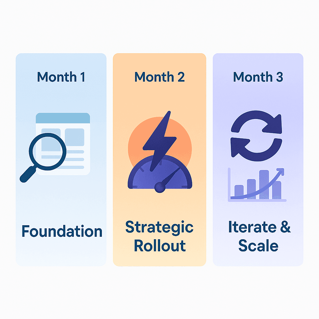
We recommend the following plan for startups looking to refresh their UX in a short time.
Month | Core Sprint Goals | Exactly What to Do |
Month 1 – Foundation (Weeks 1 - 4) | Run a fast audit & start tracking | ½-day “80/20” UX audit → screenshot every screen, rank issues by funnel impact; fix the three worst defects. |
Month 2 – Strategic rollout (Weeks 5 - 8) | Deliver visible wins | Conversational-AI POC → bolt an FAQ/on-boarding chatbot onto the app (10–30 % conversion & CSAT lifts common). |
Month 3 – Iterate & scale (Weeks 9 - 12) | Lock in the learning loop | Maze usability test #1 → recruit 5–7 real users, measure “time-to-value”, and capture qualitative pain points. |
How to work the plan
Monday stand-ups – track Hotjar events, Median FCP, and Day-1 activation every week.
Guardrail OKRs – if any release pushes load time above 2s or bumps funnel drop-off by >2 pts, roll back.
Show & tell on Day 90 – bring before/after charts to the board, including speed, retention, rating trend, and Micro-interaction CSAT comments.
Execute these three monthly sprints and move from “UX debt” to a measurable, board-ready improvement cadence.

Conclusion
A great user experience doesn't require a massive budget but intelligent prioritization and strategic thinking.
Whether you're at the pre-seed stage working with a $10k budget or scaling up at Series A, the principles are the same: measure everything, optimize relentlessly, and never lose sight of your users' journey from first touch to lasting value.
Ready to transform your startup's UX strategy?
The team at Pen On Paper has helped numerous startups implement these exact strategies, from rapid UX audits to comprehensive design system buildouts. Their startup-friendly retainers and proven 90-day implementation framework can help you achieve measurable UX improvements without breaking the bank.
Book a consultation with Pen On Paper today to discuss how these strategies can be tailored to your startup needs.