Jun 15, 2025
2025 Mobile App UX Trends: What Startups Need to Know

2025 Mobile App UX Trends: What Startups Need to Know
As the mobile app ecosystem has matured, user experience has become one of the biggest competitive advantages for startups. 88% of users say they’ll leave an app after one bad experience, and 90% stop using it if they experience poor performance.
So, product designers need to balance innovative UI with actual performance. This translates to designers needing to reduce complex components while innovating and creating new experiences.
This has been very visible in the UX trends this year. More app makers are working with minimalism, with functional chat interfaces, and micro-interactions focused on user delight have become more commonplace.
In this article, we will take you through some of these trends we’ve noticed and give concrete examples by discussing our projects. We’re going to cover:
Conversational Interfaces
Minimalism and Content-Focused Interfaces
Dark Mode and Themed Color Palettes
Micro-interactions for Enhanced Engagement
Neumorphism/Glassmorphism and Soft UI Elements
The State of Mobile UX in 2025
Conclusion
Conversational Interfaces
We've been working towards the era of conversational interfaces for decades, perhaps most notably by the ubiquitous search bar. For decades, Google’s UX has been a text box where we type questions, expecting immediate, relevant answers.
However, the most significant change came in 2022 with the launch of ChatGPT. Suddenly, the search bar led to conversations that would be remembered. Over the past few years, GPT-powered workflows have become all too common across mobile UX. And it’s one of those trends that’ll dominate the mobile app stores for years.
We’re already seeing this with popular AI products, but we’ve also seen it in work in less AI-intensive scenarios.
One of the products we worked on was RockED’s AI Roleplay. This AI-powered app lets frontline workers at automobile dealerships work with challenging customer scenarios and get the required training. We created a phone-like interface that simulated a customer conversation and then gave critical insights to the salesperson so that they could improve.
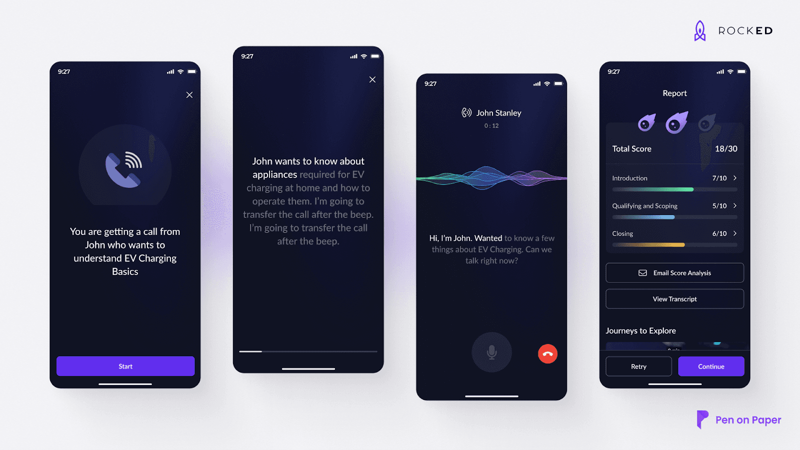
With conversational interfaces, the key is to mimic the already present UX and blend in a layer of user delight. In RockED, we used the familiar environmental cues in the call app (ChatGPT, Cursor, and Perplexity all feature similar interfaces that look familiar and mimic a messaging app) and blended it with gamified insights and data analytics tools that you’d see in your daily CRM dashboards.
In the same vein, we’re also seeing an uptick in minimalist apps that are more content-focused. Let’s cover them in the next section.
Minimalism and Content-Focused Interfaces
How do you solve a problem? For decades, the approach was to add something extra to the app to solve the user’s problem. This led to a lot of bloated apps where the messaging was hidden.
If you’ve ever worked in an enterprise setting, you’ll start seeing apps that need their category of specialized experts. Modern SaaS apps are different and follow a “less is more” philosophy. The idea is to focus on the user and make the experience quicker, easier, and smoother by highlighting essential content, allowing them to focus on primary tasks without distractions.
We followed this principle on our project with Scalenut, an AI content marketing app. Let’s talk about minimalism and our Scalenut approach step-by-step.
The UX Challenge
Scalenut has developed many features to serve their broad base of companies that want to master AEO. However, because of the feature load, users found it challenging to navigate to specific workflows. They couldn’t find their previous articles and were distracted by too many options.
Our Approach
Our methodology focused on the First Time User Experience (FTUE) and reduced Time-to-Value for Scalenut. We divided the features of the platform into three categories:
CORE features that are essential to the user’s workflows.
PERIPHERY features that make the platform more straightforward to use.
And MAGIC interventions that add to user delight.
With this in mind, we designed a centralized dashboard for the platform. Something that made the overall process of writing and creating content more intuitive and easier.
We also made the editor more friendly and focused on putting the most-used features at the forefront of our design.
The Result

Our approach created a platform that was mainly focused on content creation. The user on the platform could focus and get to a completed article in a matter of minutes.
Now that we understand the minimalist interfaces, let’s talk about the trend of dark themes in design.
Dark Mode and Themed Color Palettes
Themed color palettes aren’t precisely new in UX design. However, more and more companies are working towards incorporating a darker theme palette into their workflows.
There’s considerable debate about whether dark mode has any usability benefits. This Nielsen Group article states, “Users like dark mode but maintain similar behaviors without it.”
However, this hasn’t changed the fact that many users prefer dark mode. Apple also says that dark mode provides a more “comfortable viewing experience” for users.
Most requests we receive at Pen on Paper also ask for thematic color palettes, with many looking for darker themes.
One of the projects we want to highlight here is the Wise website redesign. Wise has worked with a light theme for most of its life, but it has tried to establish a US GTM pipeline with a new professional look centered on a darker theme.

We compartmentalized their UX design using a Bento grid system and focused on typography and theme that made their platform more readable and usable. The dark theme worked, and the website now regularly brings in demos and subscribers from the US.
Another method to improve usability comes with microinteractions. Small animations and interactions help users navigate the UX of a platform.
Micro-interactions for Enhanced Engagement
Dan Saffer, the author of “Microinteractions: Designing with Details,” said, “Microinteractions are an exercise in restraint, in doing as much as possible with as little as possible.”
Micro-interactions are simple, single-purpose interactions that improve user experience by making products more intuitive, engaging, and efficient.
These interactions can be:
Visual feedback on actions: Small animations like the heart animation when you like a post or reel on Instagram.
System status indicators: Progress bars and loading screens that capture the working of a system.
Navigational cues - “Pull to refresh” and other everyday gestures are now available throughout apps.
We’ve implemented processes like this on several platforms. We’ve implemented these things in our Scalenut, RockED, and Wise work.
The last UX trend we will focus on is neuromorphism and glassmorphism.
Neumorphism/Glassmorphism and Soft UI Elements
Soft tangible interfaces that are smooth and seamless. Think about our Bento box design for Wise, which makes navigating the platform easy.
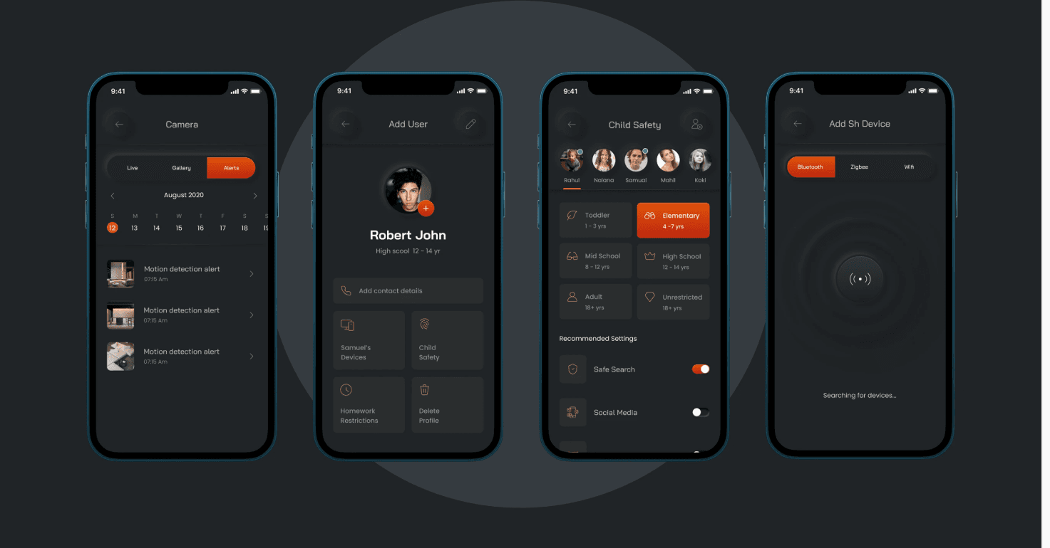
Both Glassmorphism and neumorphism use soft, inner, and outer shadow highlights to improve the sense of depth and realism associated with a product. We used this approach when working with SIF Smart Homes, making the app intuitive for homeowners.
Glassmorphism also follows the cues of neumorphism and creates glass panel-like environments that use semi-transparent elements over blurred backgrounds. Glassmorphism is very useful for apps with more vibrant color palettes, and macOS’s Big Sur and Microsoft’s Fluent Design systems use these elements heavily.
With these trends in mind, we can understand the state of mobile UX design as it exists now.
The mobile app ecosystem in 2025 isn't just maturing; it's a battleground. An increasingly sophisticated user base holds all the cards, demanding nothing less than seamless, intuitive, and genuinely delightful experiences. Forget simply keeping up with trends; the future belongs to those who aggressively redefine mobile interaction.
Here's our pointed take on the undeniable state of mobile UX right now:
Conversational Interfaces and AI Personalization are the Future: ChatGPT's emergence was just the beginning. In 2025, AI is fundamentally reshaping how users interact with apps, moving far beyond mere chatbots. We're seeing AI-driven hyper-personalization that anticipates needs, offers predictive assistance, and learns from user behavior in real-time, making interfaces adaptive and truly intelligent. This isn't optional; it's the core engine for engagement and retention.
Performance is the Ultimate UX Gatekeeper. Users are brutally impatient. A 1-second delay in page response can slash conversions by 7%, and a staggering 88% of users will abandon an app after just one bad experience or if it consistently encounters glitches. In 2025, if your app isn't fast, fluid, and resource-optimized across a fragmented device landscape, it's effectively dead on arrival. Optimizing app performance is a constant and critical challenge.
Hyper-Personalization is Non-Negotiable: Generic experiences are a relic. Users expect apps to understand their unique needs, preferences, and emotional states, leveraging real-time data to customize content and layouts dynamically. This isn't just about showing relevant products; crafting an experience that feels tailor-made, almost prescient, to foster deep loyalty.
Inclusivity and Accessibility are Business Imperatives: Dark modes and soft UI elements like neumorphism and glassmorphism aren't just aesthetic choices; they represent a concerted move towards more readable, higher-contrast, and inherently more accessible design. Designing for diverse user needs, including those with disabilities, is no longer a "nice-to-have" but a fundamental requirement for broader market reach and ethical responsibility.
Data-Driven Iteration is the Only Path to Survival: You can no longer rely on intuition to manage design for your mobile apps. Successful mobile UX in 2025 is predicated on continuous, data-driven insights. Companies must constantly analyze user workflows, identify pain points, and iteratively refine their apps to bring the most used and valued features to the forefront. This relentless focus on real user behavior separates thriving apps from those gathering dust in the app stores.
At Pen on Paper, our work on projects like RockED, Scalenut, Wise, and SIF Smart Homes underscores our commitment to this evolving reality. Winning in the mobile space in 2025 means pushing the boundaries of human-centric design, responsibly leveraging emerging technologies, and consistently refining experiences based on undeniable user insights.
Conclusion
App stores have become some of the most competitive business spaces, and winning in this space heavily depends on your UX. So, understanding and embracing these UX trends secures you a competitive edge in a crowded market. The shift towards more intuitive, personalized, and visually engaging interfaces, exemplified by conversational AI, minimalist aesthetics, thoughtful micro-interactions, and innovative soft UI elements, reflects a more profound commitment to user satisfaction.
At Pen on Paper, our projects with RockED, Scalenut, Wise, and SIF Smart Homes demonstrate our commitment to pushing the boundaries of mobile UX. By focusing on human-centric design, responsibly leveraging emerging technologies, and continuously refining experiences based on user insights, we can help our partners build apps that perform exceptionally and resonate deeply with their users.
If you want to work with us to build an intuitive user experience, please book a time on our calendar.